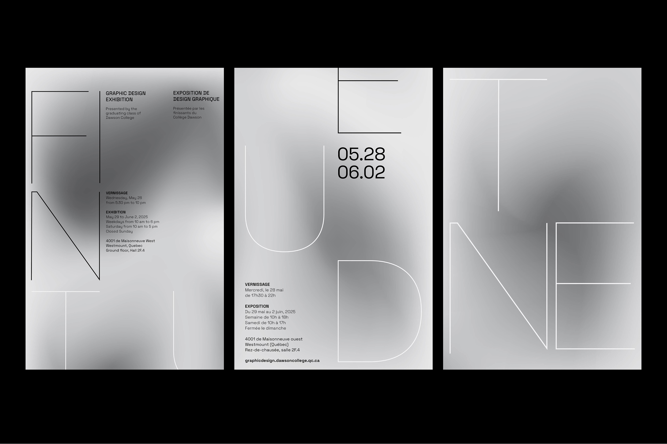
FINE
TUNED
EXHIBITION POSTER
DESIGN
Dawson College’s Graphic Design Exhibition celebrates three years of hard work from graduating students, showcasing their creativity and accomplishments. This project focused on designing a memorable poster for the event, capturing the essence of graphic design in a visually striking and meaningful way.
Fine Tuned is a graphic design poster that embodies the meticulous process of refining and perfecting one’s work before the final reveal. The concept represents the attention to detail, precision, and thoughtful adjustments made to ensure that every element aligns flawlessly. The act of polishing ideas and designs showcases the importance of thoughtful fine-tuning before handing over a masterpiece.

The use of a super-fine typeface and a strong grid creates a minimalist design that feels refined and structured. The typeface adds sophistication and subtlety, while the grid ensures balanced and organized content. This approach appeals to designers who value precision, clarity, and attention to detail, showcasing a professional yet understated aesthetic that emphasizes craftsmanship and order.